Lorem ipsum dolor, sit amet consectetur adipisicing elit. Sapiente magni distinctio explicabo quisquam. Rerum impedit culpa nesciunt enim.
Lorem ipsum dolor, sit amet consectetur adipisicing elit. Sapiente magni distinctio explicabo quisquam. Rerum impedit culpa nesciunt
enim.
Arrow
You may optionally enable arrows via the Arrow and ArrowTip component parts. Note that Zag.js opts to style these with CSS custom properties, which can be adjusted using a style attribute.
Lorem ipsum dolor, sit amet consectetur adipisicing elit. Sapiente magni distinctio explicabo quisquam. Rerum impedit culpa nesciunt enim.
Lorem ipsum dolor, sit amet consectetur adipisicing elit. Sapiente magni distinctio explicabo quisquam. Rerum impedit culpa nesciunt
enim.
Z-Index
This example will be below the sibling.
This example will be above the sibling.
Sibling (10)
This example will be below the sibling.
This example will be above the sibling.
Sibling (10)
Headless
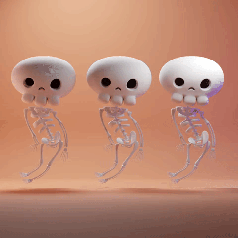
Three spooky skeletons!
Three spooky skeletons!
Programmatic Control
This is made possible via the Provider Pattern .
Lorem ipsum dolor, sit amet consectetur adipisicing elit. Sapiente magni distinctio explicabo quisquam. Rerum impedit culpa nesciunt enim.
Lorem ipsum dolor, sit amet consectetur adipisicing elit. Sapiente magni distinctio explicabo quisquam. Rerum impedit culpa
nesciunt enim.
Direction
Lorem ipsum dolor, sit amet consectetur adipisicing elit. Sapiente magni distinctio explicabo quisquam. Rerum impedit culpa nesciunt enim.
Lorem ipsum dolor, sit amet consectetur adipisicing elit. Sapiente magni distinctio explicabo quisquam. Rerum impedit culpa nesciunt
enim.
API Reference
Root
| Property | Default | Type |
|---|---|---|
children | - | ReactNode |
dir | "ltr" | "ltr" | "rtl" | undefinedThe document's text/writing direction. |
aria-label | - | string | undefinedCustom label for the tooltip. |
ids | - | Partial<{ trigger: string; content: string; arrow: string; positioner: string; }> | undefined The ids of the elements in the tooltip. Useful for composition. |
openDelay | 400 | number | undefinedThe open delay of the tooltip. |
closeDelay | 150 | number | undefinedThe close delay of the tooltip. |
closeOnPointerDown | true | boolean | undefinedWhether to close the tooltip on pointerdown. |
closeOnEscape | true | boolean | undefinedWhether to close the tooltip when the Escape key is pressed. |
closeOnScroll | true | boolean | undefinedWhether the tooltip should close on scroll |
closeOnClick | true | boolean | undefinedWhether the tooltip should close on click |
interactive | false | boolean | undefinedWhether the tooltip's content is interactive. In this mode, the tooltip will remain open when user hovers over the content. |
onOpenChange | - | ((details: OpenChangeDetails) => void) | undefinedFunction called when the tooltip is opened. |
positioning | - | PositioningOptions | undefinedThe user provided options used to position the popover content |
disabled | - | boolean | undefinedWhether the tooltip is disabled |
open | - | boolean | undefinedThe controlled open state of the tooltip |
defaultOpen | - | boolean | undefinedThe initial open state of the tooltip when rendered. Use when you don't need to control the open state of the tooltip. |
getRootNode | - | (() => Node | ShadowRoot | Document) | undefinedA root node to correctly resolve document in custom environments. E.x.: Iframes, Electron. |
RootProvider
| Property | Default | Type |
|---|---|---|
value | - | TooltipApi<PropTypes> |
children | - | ReactNode |
RootContext
| Property | Default | Type |
|---|---|---|
children | - | (tooltip: TooltipApi<PropTypes>) => ReactNode |
Trigger
| Property | Default | Type |
|---|---|---|
element | - | ((attributes: HTMLAttributes<"button">) => Element) | undefinedRender the element yourself |
Positioner
| Property | Default | Type |
|---|---|---|
element | - | ((attributes: HTMLAttributes<"div">) => Element) | undefinedRender the element yourself |
Content
| Property | Default | Type |
|---|---|---|
element | - | ((attributes: HTMLAttributes<"div">) => Element) | undefinedRender the element yourself |
Arrow
| Property | Default | Type |
|---|---|---|
element | - | ((attributes: HTMLAttributes<"div">) => Element) | undefinedRender the element yourself |
ArrowTip
| Property | Default | Type |
|---|---|---|
element | - | ((attributes: HTMLAttributes<"div">) => Element) | undefinedRender the element yourself |